Stats
Video tour of new Stats functionality, which entered beta in 4Q 2018.
Artifact quick links:
• Dashboard for Authors wireframes
• Dashboard Denominator Problem
• Jobs-to-be-Done mind map
• Facilitator Stats wireframes
• Thoughts about scoring
Business challenge
HR teams have always been starved for meaningful data about their learning programs. The best they've usually been able to obtain are simple completion reports. There's often little to help them improve their learning content for future learners, let alone react in real time to learners already in progress.
Our solution
From the beginning, my goal with the Learning Album platform was to generate analytics that would help HR staff make decisions to improve the outcomes of their learning programs. In 2014, I designed and launched a Dashboard application to augment the Delivery and LCMS applications already in place. Together, these three applications comprised an end-to-end digital platform that HR could use to create, deliver, and track their learning programs.
The first version of the Dashboard targeted facilitators and provided data about basic topic and knowledge check completions for all of the learners in their classes.
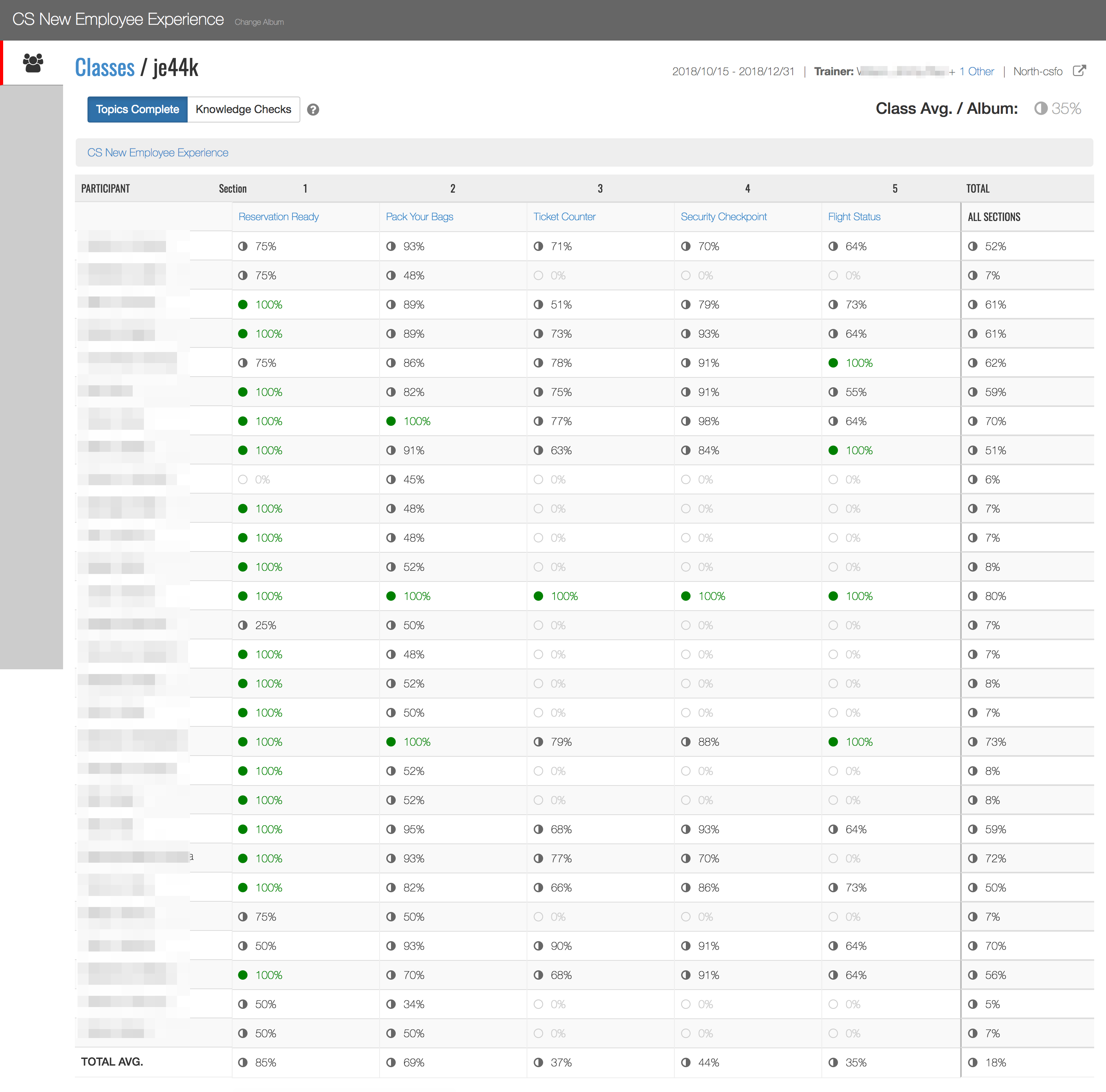
A dashboard like the one above was automatically built for every class in the Learning Album Delivery application. Facilitators didn't need to generate a report or download a csv file. They could simply click a button from within an album and launch the corresponding dashboard.
Towards a new Dashboard
While these dashboards were useful to the 1,600 facilitators who relied on them, they were only scratching the surface of what was possible (and they didn't look very dashboard-y). We were collecting all sorts of user data not included in the dashboards: what pages someone viewed, how long they spent on each page, if a page had interactions on it then how many did the user engage with. The challenge was figuring out a way to extract meaning from it all.
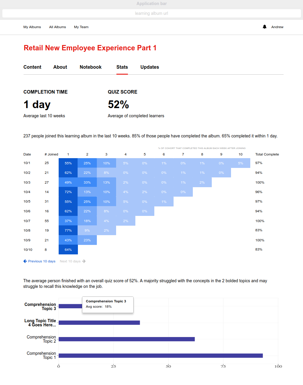
I designed a new Dashboard application that would be targeted at the instructional designers who created the learning albums. This time, we would provide more aggregated summary data up front. We would also try and surface meaningful insights based on patterns in the data. Here's an image from one of my wireframes:

It took six months to build this version, but almost immediately it paid dividends. I ran a pilot with the Retail sales group, specifically looking at their new hire album. Nearly 17% of the pages in their album registered little to no learner engagement. This 17% accounted for 20 hours worth of training in a 3 week program. If learners weren't getting value out of that content, it could be improved or removed altogether.
Unfortunately, this new Dashboard required a tremendous amount of near real-time data aggregation, and our approach was unsustainable. The data for each class and learner was changing too rapidly for us to simultaneously extract and transform it, at least using the standard relational database we already had in place. This was only complicated by the fact that an album could be re-published at any time, and each publish could feature a different schema as the content was changed. For a sample of the thorny problems we were dealing with, here's a write up I made at the time:
Due to these issues, this version of the Dashboard never got out of beta. But it provided us with critical learnings for the next version of our analytics application.
Stats
This time around, we built "Stats" as a separate service that injected visualized dashboards into every album in version 6 of the Delivery application. We implemented a time-series database (kdb+) with parallel processors to avoid the pre-aggregation of results required of a relational database. This allowed us to make changes to the various metrics calculated without re-importing the data, for example if an album is re-published and the schema changes.
Beyond rethinking the technical solution with my lead developer, I also spent a lot of personal time talking to facilitators about what they wanted to accomplish with learning analytics. After 10-15 interviews, the themes were pretty consistent and I was able to sketch out a basic mind map following the Jobs-to-be-Done framework.
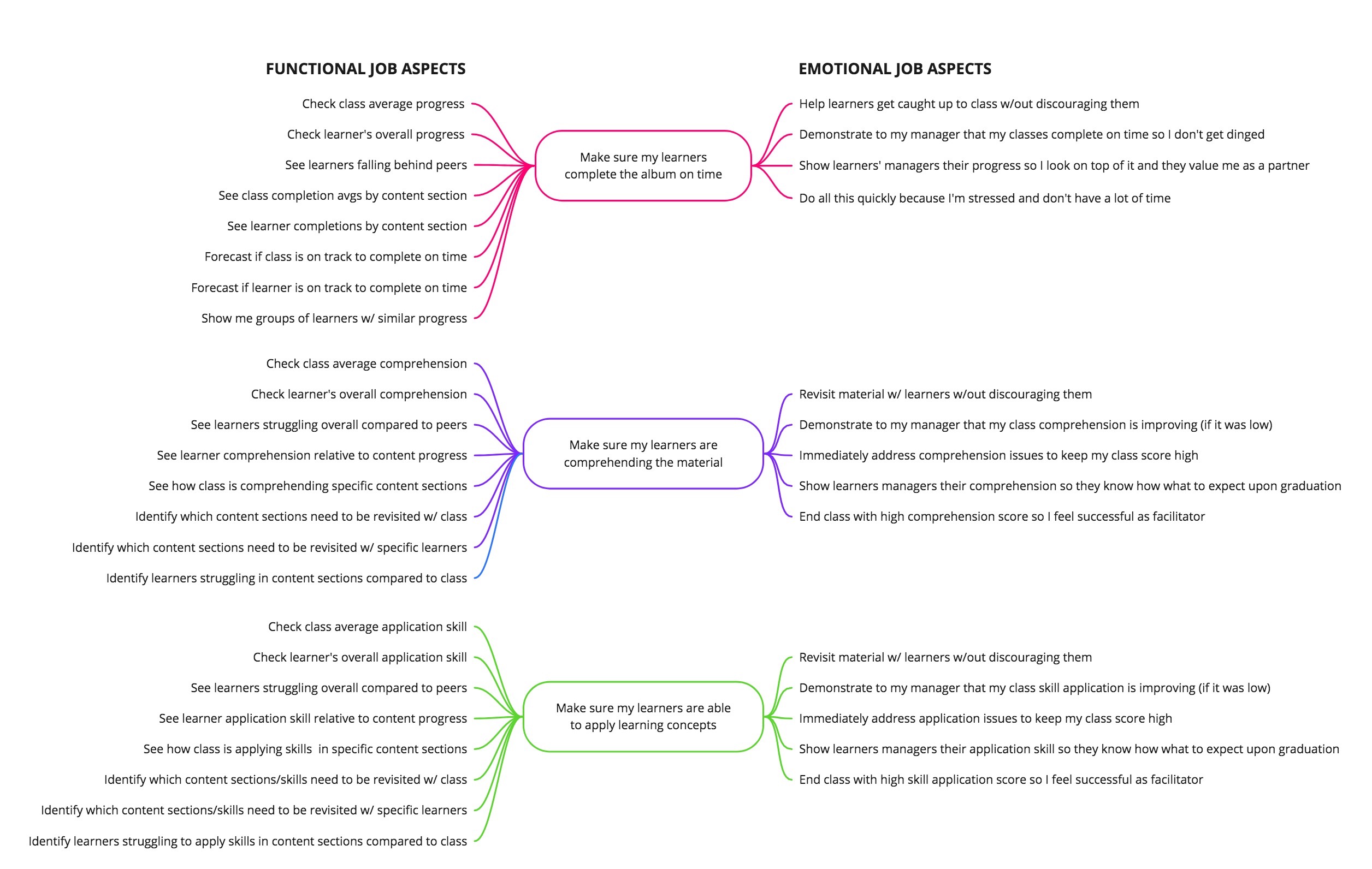
I used the mindmap to create requirements, user/job stories, and wireframes. Thinking about the metrics we wanted to provide at the end of a user's workflow actually caused us to rethink some of the core requirements of the Studio and Delivery applications. Specifically, we decided to simplify how we would demonstrate and measure learner comprehension and skill application. We introduced the notion of quizzes (comprehension) and assignments (application). Both would provide quantifiable measures that we could aggregate and report in Stats, but assignments in particular added a qualitative dimension by asking facilitators to rate learner submissions.
We now had three solid measures to provide comprehensive stats on each class and learner. Before we could begin development, however, we had to do some hard thinking about assignment scoring. Specifically, should we factor into the overall assignment score the actual rating applied by the facilitator AND how many assignment attempts the learner made to get a good score. In the end, we decided not to factor in the number of submissions. I created this document with the data scientist I hired and I include it here because it illustrates my data analysis process.
Thoughts about assignment scoring
Once that was sorted out (we decided not to factor in Application Learning Efficiency), it was time to start development, first of the importer and kdb+ queries, then the visual UI. Here's a PDF of UI wireframes I created based on my customer interviews and Jobs-to-be-Done mindmap:
Facilitator view of active class
What's next
In the short term, Stats views need to be created for all types of albums and user roles, including self-led albums that don't rely on classes with defined start and end dates, since people can join these albums at any time. Instead, we'll create dynamic cohorts and generate a cohort analysis chart (of sorts), kind of like this:
In the long term, we'll wrap our Stats data into the GraphQL API and make that available to trusted third-party applications, so they can query and fetch the data they want. For example, Verizon HR uses Qlik to provide comprehensive dashboards detailing individual facilitator performance. These dashboards are used in annual performance reviews. Learning Album Stats data would help paint a complete picture in the Qlik dashboards and speak to facilitator performance at a much deeper level than what's captured today.
The GraphQL API can also be used to align Learning Album Stats data with on the job employee performance. This has long been the holy grail in the HR space, pairing learning data with actual business metrics to show what tangible impacts a training program had on performance. All of my work on learning analytics has brought Verizon to the cusp of achieving this aim. In 2019, I believe Verizon will achieve its goal of generating real-time learning-to-KPI data alignment for all content created in the Learning Album platform.
Technology stack for the latest version of Learning Album Stats:
Node.js 10+, MySQL 5.7+, PostgreSQL 10+, kdb 3.4 (w/ json.k and odbc.k), AWS EC2, AWS RDS (MySQL and PostgreSQL), GraphQL, React.js, D3.js, Recharts.org, New Relic.